Fusedash
Transform raw data into clear dashboards so your team can instantly act on powerful insights.
About Fusedash
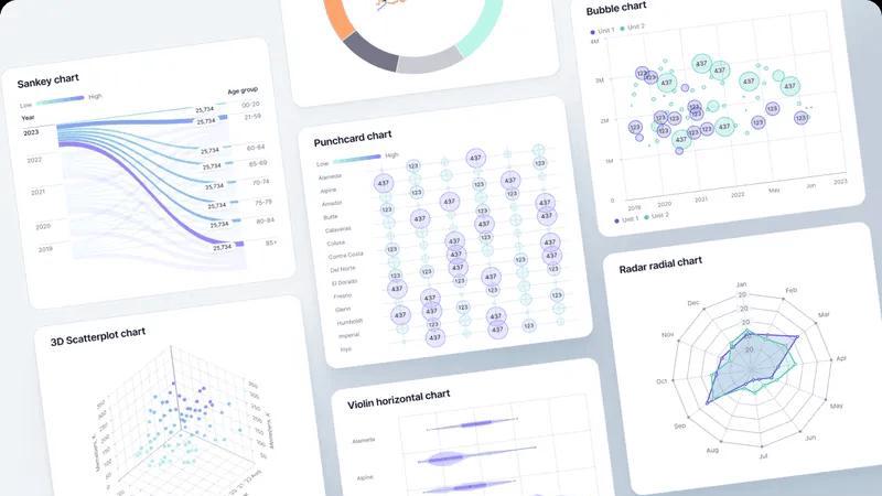
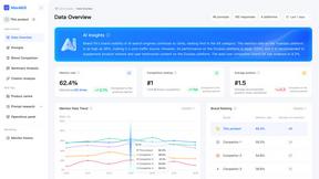
Fusedash is your team's command center for clarity and action. It is an AI-powered data visualization platform designed to transform the chaotic sprawl of disconnected data into a unified, trusted source of truth. This powerful workspace empowers teams to move beyond static, manual reporting and conflicting data stories. With Fusedash, you can seamlessly create decision-ready dashboards, interactive charts, detailed maps, and narrative reports—all from a single, connected dataset. The core mission is to break the cycle of inefficiency: you define your key metrics and KPIs once, and then reuse those consistent definitions across every view and report. This ensures absolute alignment, from leadership to marketing to operations, as everyone is empowered with the same trusted numbers. Built for teams ready to accelerate their decision-making, Fusedash provides not just real-time monitoring but deep understanding, allowing users to drill down into the 'why' behind the numbers. Integrated AI features like natural language data chat and smart visualization assistance make data exploration intuitive and accessible. Fusedash is more than a tool; it's a transformation engine that turns raw data into a shared narrative, driving alignment, empowering action, and propelling your entire organization forward with confidence.
Features
Unified AI-Powered Workspace
Fusedash consolidates your entire data workflow into one intelligent platform. Instead of juggling multiple disconnected tools for dashboards, charts, maps, and reports, you can build them all from a single, consistent dataset. This unified approach, enhanced by AI, eliminates redundant work and ensures every team member is looking at the same version of the truth, dramatically increasing efficiency and reducing time-to-insight.
Flexible, Audience-Specific Views
Empower every stakeholder with the exact view they need. Fusedash allows you to transform one core dataset into multiple formats—be it an executive dashboard, a detailed chart for analysis, an interactive map for geo-data, or a narrative report for context. You can customize layouts, filters, and time ranges for each audience, ensuring clarity and relevance without rebuilding logic from scratch for every request.
AI Chart Generator & Smart Chat
Jumpstart your data storytelling with intelligent assistance. The AI Chart Generator instantly suggests the best visualizations from your CSV or API data, helping you create clear, compelling charts in minutes. Furthermore, the integrated Smart Chat lets you ask questions about your data in plain language, receive suggested metrics and breakdowns, and instantly turn those insights into shareable dashboard views, making data exploration effortless.
Consistent Metric Definitions & Reusability
Build a foundation of trust and consistency. With Fusedash, you define your critical KPIs, dimensions, and calculations once in a centralized logic layer. These definitions are then automatically applied and reused across every dashboard, chart, and report you create. This guarantees that "revenue," "active users," or "conversion rate" means the same thing everywhere, ending debates over data integrity and aligning the entire organization.
Use Cases
Executive Leadership & Strategic Reporting
Empower leadership with a single source of truth. Executives can access a high-level, real-time dashboard showing company-wide KPIs, then seamlessly drill down into narrative reports that explain the "why" behind trends. This eliminates the weekly scramble for conflicting reports and provides a consistent, trusted foundation for making swift, strategic decisions that drive the business forward.
Marketing Performance & Campaign Analysis
Transform marketing data into actionable growth insights. Marketing teams can connect all their campaign data sources to monitor performance in real-time, use AI to quickly generate charts comparing channel ROI, and create segmented maps to visualize regional campaign effectiveness. This enables rapid optimization of spend and strategy, turning data into a competitive advantage.
Operational Monitoring & Real-Time Alerts
Give operations teams the power of live intelligence. Monitor key operational metrics—from logistics performance to system health—on dynamic, real-time interfaces. Set up alerts and use drill-down capabilities to instantly investigate anomalies by segment, region, or time period, enabling proactive problem-solving and ensuring seamless business continuity.
Cross-Departmental Alignment & Storytelling
Break down data silos and unite your organization. Fusedash allows different departments to build their own views from the same core data, ensuring alignment. Combine performance dashboards with "Storytelling" sections to add crucial context for stakeholders, explaining what changed, why it matters, and what the next steps are, fostering a culture of shared understanding and collaborative action.
Frequently Asked Questions
What types of data sources can I connect to Fusedash?
Fusedash is built for flexibility. You can start instantly by uploading CSV or Excel files. For live, updated data, you can connect directly to countless applications and databases via API integrations. The platform also allows you to combine multiple datasets—like your internal data with public data—into a single, coherent view for richer analysis and reporting.
How does Fusedash ensure data consistency across teams?
Consistency is our core architecture. You define your key metrics, formulas, and business logic in a centralized layer within Fusedash. Once defined, these "single sources of truth" are automatically applied to every dashboard, chart, map, and report you create. This means everyone across leadership, marketing, and operations is always analyzing and discussing the same, trusted numbers.
Can I use Fusedash just to create quick, standalone charts?
Absolutely. Fusedash is designed for both comprehensive dashboards and agile chart creation. Our AI Chart Generator is perfect for users who need to quickly visualize data from a CSV or API to create a chart for a presentation or report. You can use these as powerful standalone visuals or easily embed them into larger, multi-view dashboards later.
How does the AI Smart Chat feature work?
The AI Smart Chat acts as your data co-pilot. In plain language, you can ask questions about your data like, "What were sales by region last quarter?" or "Show me a breakdown of user sign-ups by source." The AI will interpret your question, query the connected data, and provide an answer with suggested visualizations. You can then instantly publish that insight as a new chart or metric within your dashboard.
Similar to Fusedash
GeoRank
Planning a relocation or long-term stay abroad? Compare places on sunshine, cost, tax, visa access for your passport, then ask AI about your short
InContekst
Decision support framework for high consideration businesses with mix of online and offline channels, content-rich sites, and long customer journeys.
PrompTessor
Stop guessing with AI and start commanding it with PrompTessor, the all-in-one workspace to generate, optimize, and master every prompt for flawless.
EnsembleData
Turn real-time social data into your competitive edge with EnsembleData's powerful scraping APIs.

Edge Arena
Edge Arena empowers you to test business decisions against competing AI agents, ensuring you leave with a robust, defendable plan.
Decker
Decker is the deliverable OS that helps consultants build better work and monetize their expertise by turning it into AI training data.
Subiq
Subiq empowers small teams to effortlessly manage SaaS subscriptions, track spending, and eliminate wasted costs for maximum efficiency.